Click on the eye icons (like the one below) to learn more about a feature.
Account Finder
By asking a few quick questions, this tool helps guide a user torward the perfect account for their needs.
Blog Posts
See all your posts in one place starting with the most recent. Important posts can even be pinned to keep them at the top of the list.
Blog Tags
Tags are a great way for users to quickly view the specific content they're interested in.
Comparison Chart
Give users a quick view of your accounts to help them decide — and convert on the spot.
Comparison Chart
Give users a quick view of your accounts to help them decide — and convert on the spot.
Forms
Forms on a FIRSTBranch are securely transmitted to our leads manager system. A confirmation email is also automatically generated and sent to the user.
Current Customer Modal
This popup checks if an individual is already a customer or member with your financial institution. If a user selects "yes", they will be taken to a short form with minimal information needed. If "no," they will be directed to the full application.
Financial Calculators
FIRSTBranch offers five default calculators with every site. We can also partner with your preferred third-party vendor — like Banzai or Dinkytown — to add more as needed.
Footer
As a global element on your site, the footer includes important links — and can even function as a miniature sitemap. Everything from popular pages to compliance-related information (like your Privacy Policy and FDIC/NCUA logos), can be placed here.
Header
Headers typically contain the primary navigation menu, a utility nav, and any other important calls to action. They can even be "sticky," staying present as the user scrolls down the page.
Banner
As the most popular space on the site, the banner is typically reserved for your most important promotion(s). It can be static, randomized on refresh, or used as a carousel to highlight multiple products & services.
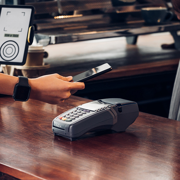
Digital Banking Promo
Consumers expect financial institutions to offer the tech they need — and will pass on those that don't. Highlighting your digital banking on the homepage helps build that trust immediately.
Featured Rates
Promoting your top rates helps users (particularly rate shoppers) quickly decide why they should choose your financial institution for their banking needs.
Interactive Tabs
This toggle allows you to promote multiple products & services for different audiences — without taking up extra page length.
First Product Feature
The higher up on the homepage, the more hits a product or service will typically get. That makes this space perfect for promoting what's important to your institution.
Image Gallery
An image gallery is a quick & simple way to show off your community involvement. In this particular case, the thumbnails open up a slideshow when clicked.
List Page
This page type lists a variety of related products & services, briefly describes the benefits of each to your users, and encourages them to learn more.
Locations Listings
Our card style is used to highlight the primary information for every branch and/or ATM location. More information such as mailing address, hours, and any other branch specific information, can be found by clicking on the "Details" links.
Google Maps
Highlight all your locations on an interactive map — and make it easy for users to find which location is most convenient for them.
Mega Menu
Our mega menu approach allows a user to access any page on the site in fewer clicks. It also provides an extra area for cross-sells.
Online Banking Modal
The online banking login modal (OBL) connects to your online banking provider and is where your customers or members log in. It also double as a cross-sell opportunity.
Key Features
Quickly highlight the main benefits of a product or service with no scrolling required by the user.
Secondary CTA
Adding a CTA lower on the page prevents the user from having to scroll back up — and provides another opportunity to convert.
Product Cross-Sells
Cross-sell related products & services on individual pages as you see fit — or assign them to entire folders throughout the site.
Product Tabs
Tabs optimize how content is organized on a page by reducing scroll time and providing users with control over the info they want to see.
Rates
Rates are especially important to potential customers or members. The dropdown seen on the left allows users to easily find the numbers they're looking for.
Search Popup Features
Save users time by highlighting the most commonly searched information & content on your site.
Grid Option
This is a great way to display your team members in a condensed & concise manner. A "Learn More" link can also be included that takes the user to a landing page unique to each team member.
Row Option
This option is useful if you only need to highlight a few team members. Users can also view all their information in one spot.