This is an example of a simple content module used as a FAQ section with accordions
FAQs
{beginAccordion}
Question 1
Lorem ipsum dolor sit amet, consectetur adipiscing elit. Curabitur velit purus, scelerisque non dignissim a, malesuada ut libero. Aliquam maximus turpis vitae elementum malesuada. Ut nec purus ultrices, fringilla lacus a, vehicula urna. Nunc at molestie dui, vitae iaculis orci. Integer sed mollis mauris. Pellentesque mollis malesuada lacinia. Cras vitae nibh a augue facilisis bibendum et in magna. Vestibulum nec tempus quam, sed lobortis dui. Nulla non urna finibus, rutrum augue a, mollis turpis.
Question 2
Curabitur velit purus, scelerisque non dignissim a, malesuada ut libero. Aliquam maximus turpis vitae elementum malesuada. Ut nec purus ultrices, fringilla lacus a, vehicula urna. Nunc at molestie dui, vitae iaculis orci. Integer sed mollis mauris. Pellentesque mollis malesuada lacinia. Cras vitae nibh a augue facilisis bibendum et in magna. Vestibulum nec tempus quam, sed lobortis dui. Nulla non urna finibus, rutrum augue a, mollis turpis. Lorem ipsum dolor sit amet, consectetur adipiscing elit.
Question 3
Lorem ipsum dolor sit amet, consectetur adipiscing elit. Curabitur velit purus, scelerisque non dignissim a, malesuada ut libero. Aliquam maximus turpis vitae elementum malesuada. Ut nec purus ultrices, fringilla lacus a, vehicula urna. Nunc at molestie dui, vitae iaculis orci. Integer sed mollis mauris. Pellentesque mollis malesuada lacinia. Cras vitae nibh a augue facilisis bibendum et in magna. Vestibulum nec tempus quam, sed lobortis dui. Nulla non urna finibus, rutrum augue a, mollis turpis.
Question 4
Lorem ipsum dolor sit amet, consectetur adipiscing elit. Curabitur velit purus, scelerisque non dignissim a, malesuada ut libero. Aliquam maximus turpis vitae elementum malesuada. Ut nec purus ultrices, fringilla lacus a, vehicula urna. Nunc at molestie dui, vitae iaculis orci. Integer sed mollis mauris. Pellentesque mollis malesuada lacinia. Cras vitae nibh a augue facilisis bibendum et in magna. Vestibulum nec tempus quam, sed lobortis dui. Nulla non urna finibus, rutrum augue a, mollis turpis.
Question 5
Lorem ipsum dolor sit amet, consectetur adipiscing elit. Curabitur velit purus, scelerisque non dignissim a, malesuada ut libero. Aliquam maximus turpis vitae elementum malesuada. Ut nec purus ultrices, fringilla lacus a, vehicula urna. Nunc at molestie dui, vitae iaculis orci. Integer sed mollis mauris. Pellentesque mollis malesuada lacinia. Cras vitae nibh a augue facilisis bibendum et in magna. Vestibulum nec tempus quam, sed lobortis dui. Nulla non urna finibus, rutrum augue a, mollis turpis.
Question 6
Lorem ipsum dolor sit amet, consectetur adipiscing elit. Curabitur velit purus, scelerisque non dignissim a, malesuada ut libero. Aliquam maximus turpis vitae elementum malesuada. Ut nec purus ultrices, fringilla lacus a, vehicula urna. Nunc at molestie dui, vitae iaculis orci. Integer sed mollis mauris. Pellentesque mollis malesuada lacinia. Cras vitae nibh a augue facilisis bibendum et in magna. Vestibulum nec tempus quam, sed lobortis dui. Nulla non urna finibus, rutrum augue a, mollis turpis.
{endAccordion}
This is an example of a simple content module
With a section background applied
{beginNavtabs}
Understanding Page Modules
- Page modules are a set of structures that can be used to easily make custom modular pages and gives more control over many aspects of how content will show on a page
- Page Modules are a great way to create customized landing pages, but can also be included on Product, Category/List, and Details pages too
- Many of the page modules are built to replicate "custom" elements that would typically be found elsewhere on the site such as the homepage or a category/list page
- Each page module content piece will represent one section (or band) on a page
Using Page Modules
- All page module structures work on a sorted basis. This means that a content piece will only appear on a page if that page is either selected in the "Page" dropdown or present in the list of Page(s).
- For example when starting with a fresh "Modular Page", the page will appear blank until module content pieces have been created/set for this new page.
- For organizational purposes, each content piece should be named in a strategic manner. If used only on a single page, it is recommended to inclue the page name in the title. If a content piece is to be used on multiple pages, it may be more suitable if the title reflects the content rather than the page(s) (ex: Digital Banking promo)
- The same module can be used more than once on the same page, each section will just need it’s own content piece created
- If duplicate instances of a module are used on the same page, it is recommended to append some unique identifier to the title for easy indentification
- All page modules have a “Section Order Display” dropdown that can be used to manually adjust the order of the sections on the page. The default order is the order in which the modules appear in KCMS.
- The lower the number, the higher up on the page that section will appear.
- Note: The order of the sections inside KCMS may not always match up to the order of the sections on the live page. To help with this we have added tooltips that appear only in KCMS to help identify what the order WILL be
- If on a category, product, or details page, the order will be relative to other modules present on that page, not the entirety of the page
- Some modules include an optional "Headline" wysiwyg and should only be used if the section should include a headline of some sort.
- Some of the modules have a checkbox for “Section Background”. This will simply add a full-width background to that section and can be used to provide clear visual breaks between sections.
- Some modules will have a checkbox called “Clickable Containers”. This simply turns each feature into a clickable container if there is a link in it’s content.
- If there is ever a case where a feature content wysiwyg has 2 links in it, this should be unchecked or the user will not be able to access both links.
- For any module that includes multiple field sets, feature 1, feature 2, etc, it is not necessary to fill in ALL of the features. Only the first set of fields is required. But, if you are to include a 2nd, 3rd or 4th feature, all of the fields corresponding to it should be filled to keep consistency.
- By default each of the sections will auto scale the width if there are less than the maximum number used (ex: only 3 of the 4 are filled out).
{endNavtabs}
This is an example of the Row of Feature(s) w/ Icon module
This example has 3 features included and a section background applied


This is an example of the Row of Feature(s) w/ Icon module
This example has 4 features included w/ card style backgrounds and clickable containers


This is an example of the Row of Feature(s) w/ Image module
This example has 3 features w/ a section background applied


This is an example of the Row of Feature(s) w/ Image module
This example has 4 features w/ a card style background and clickable containers


This is an example of the Full Width Feature(s) w/ Alternating Image module
This example has a headline, both images used, section background, and clickable containers.
Feature 1 Headline
On tablet & desktop the first feature will have the image on the left and content on the right. On mobile, the image will stack above the content.
Feature 2 Headline
On tablet & desktop the second feature (if included) will have the image on the right and content on the left. On mobile, the image will stack above the content.
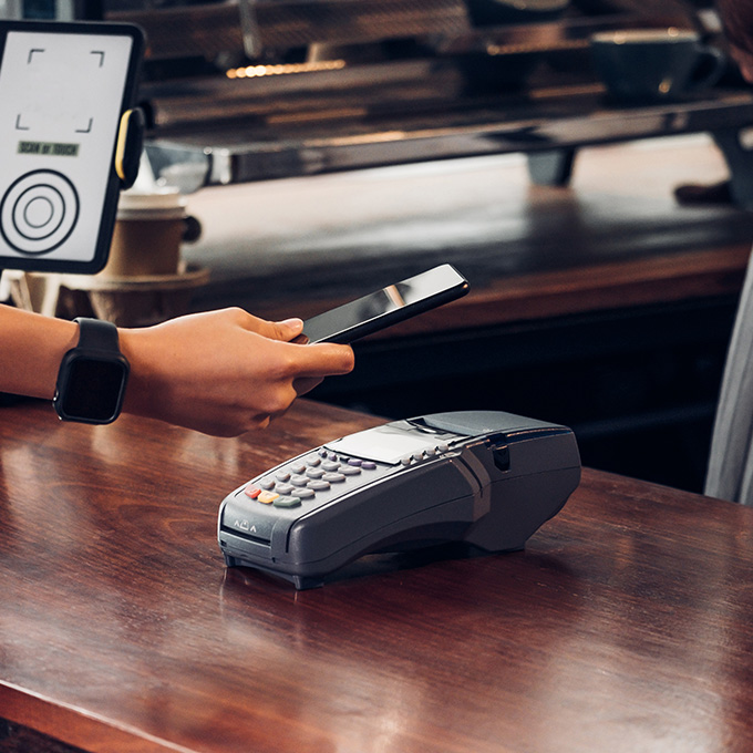
This is an example of the Full Width Feature w/ BG Image module
Lorem ipsum dolor sit amet, consectetur adipiscing elit. Curabitur velit purus, scelerisque non dignissim a, malesuada ut libero. Aliquam maximus turpis vitae elementum malesuada.
This is an example of a chart module
Subheadline if needed.
| Loan Type | Great For | Minimum Loan Amount | Rate | Terms |
|---|---|---|---|---|
| Home Equity Loans |
|
$50,000 | Fixed | Up to 180 months |
| Home Equity Line of Credit (HELOC) |
|
$10,000 | Variable | 120-month draw (interest only payment) |
| Home Improvement Loan |
|
$10,000 | Fixed | Up to 180 months |